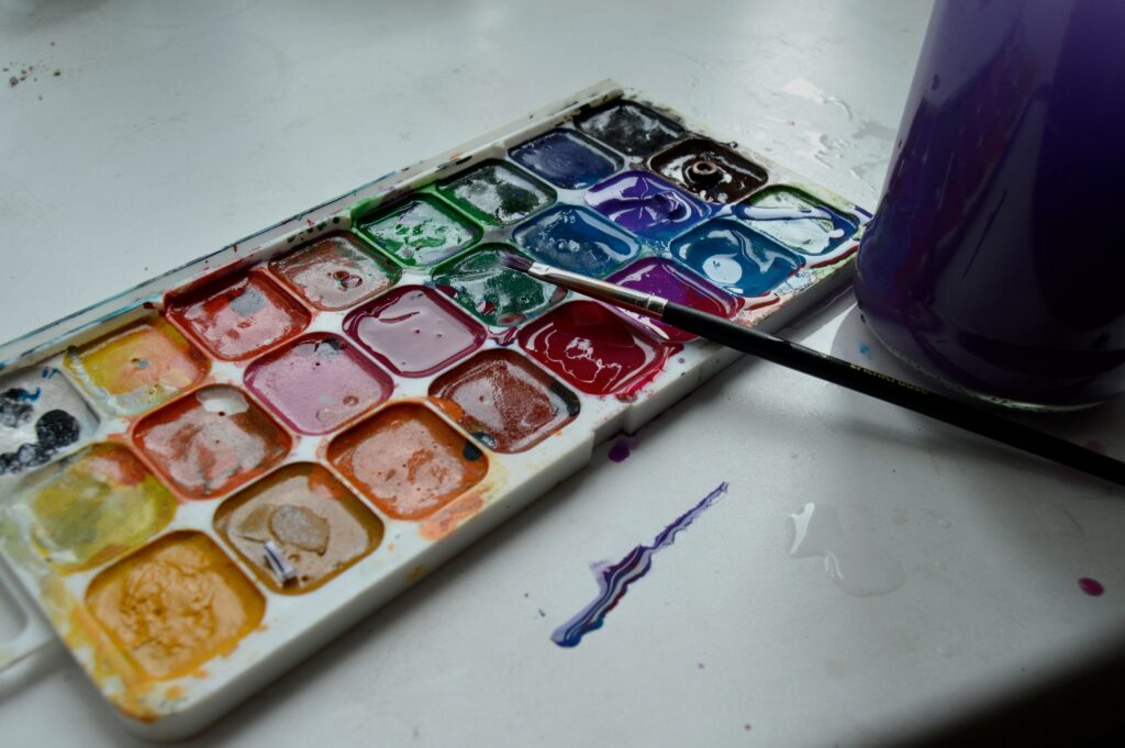
Dry Brush Detailing
Dry brush technique is all about restraint. You load the brush with a touch of paint barely enough to coat the bristles and drag it lightly over the surface. The goal isn’t coverage; it’s character. This method teases out gritty, broken strokes that add layered depth and raw texture to your painting.
It works best on rough paper or a textured canvas where the fibers can catch just enough pigment. Think aged wood, stone, or loose hair details places where precision isn’t the point, but atmosphere is. Use it to break up flat zones or imply structure without hard lines. Minimal effort, maximum texture. That’s the dry brush way.
Controlled Glazing
Controlled glazing is all about building depth one veil at a time. The technique uses thin layers of translucent paint to subtly shift tone and light no hard edges, no brute force. It’s a quiet kind of power.
You’ll want to start with acrylics or oils thinned down with glaze medium. Water alone won’t cut it you need the medium for consistency and control. Apply in smooth, even coats. Let each layer dry fully before adding the next, or you risk turning it all into muddy soup.
Glazing rewards patience. It’s not flashy, but it adds a richness and complexity that’s hard to fake. This is where you get that glow, that sense of atmosphere. Ideal for everything from portraits to abstract layers, it’s a method that separates the careful from the careless.
Feathering for Seamless Blends
Feathering is a go to technique when you need color transitions that don’t scream for attention. Think skies at dusk, cheekbones in soft light, or any place where a harsh line would ruin the mood. The key move here is using soft, light strokes while the paint is still wet so you can guide one color into the next without a visible jump. It’s subtle, but powerful.
Use a clean, damp brush or lightly drag the tip of your brush over the boundary where two colors meet. Don’t press too hard. Let it glide. The more patient you are, the smoother the result. If your paint has dried, you’ve missed the window rewet gently or layer again and try to hit the timing better.
Feathering shines in areas that need atmosphere or nuance. It’s not flashy, but when done right, it makes your work feel dialed in and intentional.
Scumbling for Soft Focus
Scumbling is one of those techniques that looks like a happy accident until you try it on purpose and realize how much control it really takes. The goal here is to drag a nearly dry brush loaded with light paint across a darker layer, letting just enough pigment catch the raised surfaces. It’s gritty, patchy, and perfect for creating fog, light diffusion, or subtle aging effects.
This works best when your underlayer is fully dry. You want the top layer to sit unevenly don’t smother it. The brush you use matters: stiff bristled brushes are non negotiable if you want that controlled scruff instead of a muddy blend. Round or flat bristles can both work, depending on how tight the area is.
Think of scumbling like a whisper across the canvas. It adds atmosphere without overpowering, a quiet haze that lets shadows breathe and light feel earned rather than slapped on. Not flashy but it pulls weight.
Stippling with Intent

Stippling is more than just dotting the canvas when used with precision, it’s a transformative brush technique that adds energy, texture, and depth to your work.
What Is Stippling?
Stippling involves applying small dots of paint directly to the surface, varying in density and size to suggest form, volume, and texture. It’s often associated with pointillism, but also works well for realistic detail work.
Why It Works
Stippling creates texture through contrast and spacing. Densely packed dots can darken an area, while lighter dotting can create highlights or soft transitions.
Benefits:
Adds nuanced texture to skin, foliage, fabric, and surfaces
Mimics pointillism for a stylized, painterly finish
Builds volume through methodical layering
Tips for Successful Stippling
Vary your pressure: Light dabs for small dots, firmer press for larger ones
Be patient: Stippling is time intensive but worth the effort
Use a steady hand: Consistency is key to achieving an even rhythm
Choose the right brush: Small round or liner brushes give you maximum control
When to Use It
Stippling shines when you want to add rich texture or intricate details. Use it as a focal technique or subtly merge it with others, like glazing or dry brushing, to add extra dimension.
Time invested in mastering stippling pays off with expressive, detailed results that photographs just can’t replicate.
Cross Hatching with a Brush
Cross hatching isn’t just for ink. You can apply the same concept with a brush to build depth and value, especially in oil or acrylic painting. Use directional strokes at varying angles, layering one set of marks atop another. It gives you control over shading without relying on full blending perfect for when you want texture with structure.
This technique mimics the pen and ink feel but with the softness of paint. Start with a mid toned base, then add darker or lighter brush strokes diagonally to guide the eye and create volume. Don’t rush it let your brush do the talking in short, confident flicks. For more nuanced effects, blend lightly at shifting angles between layers. That’s where the magic happens where dimension isn’t just seen, it’s felt.
Bristle Dragging for Edge Work
This technique is all about control. Load paint sparingly just enough to tint the bristles and then drag the brush gently across the surface. The goal isn’t full coverage. You’re aiming for contrast: crisp, broken edges that disrupt the eye just enough to feel intentional.
Bristle dragging works best when your brush is nearly dry. Think of it as sketching with paint. It’s ideal for textural highlights woodgrain, stone, fabric creases and delivers a weathered, layered effect that’s hard to fake with heavier strokes. Overloading the brush ruins the detail and muddies the crispness, so keep it lean. Less is more here.
Use a stiff, flat brush for stronger edges, and don’t press too hard. Let the texture of the canvas or board do some of the work.
Edge Softening with Fan Brushes
Fan brushes are underrated tools when it comes to smoothing out the complicated. Whether you’re working around flowing hair, the hazy edges of a rolling landscape, or the layered lines of animal fur, this brush shape earns its place. The key is in the spread the fan allows paint to glide across curves and corners without harsh stops or lines.
Use it dry for quick softening, or combine it with a blending medium when you need more control in transition zones. Don’t rush let the bristles do the work and build up the softness gradually. Too much pressure and you’ll lose the subtle fade. Think of this technique as feathering’s broader, moodier cousin: low drama, high payoff.
Push and Twist Dynamics
This technique is all about pressure and rotation. You start with a firm press to lay down a thick, bold beginning, and then twist the brush as you lift to taper the stroke. It’s simple in theory, but the beauty is in the practice. The result is a line that goes from strong to whisper thin in one clean motion a move packed with life and motion.
It’s a go to stroke for painting foliage, flower petals, or anything that needs organic elegance. Want a petal with weight at the base and a delicate tip? This is how you get there. Want a vine that dances across the canvas? Twist and pull.
Use rounded brushes here. Their flexible shape gives you just enough bounce to control the taper without forcing it. Flat brushes can be used, but they’ll fight you. Rounded tips help you win.
Mastering this move isn’t just about adding flair it’s about painting with rhythm.
Layering with Impasto Intent
This one’s all about impact. Impasto isn’t just thick paint it’s bold, sculptural texture you can feel. To pull it off, load up a palette knife or stiff brush and go in with confidence. Push the paint onto the canvas like you mean it. Let it sit, let it rise. You’re not smoothing this out you’re building peaks and ridges that catch light, cast shadows, and dare the viewer to look closer.
For drama and dimension, highlight the raised edges and deepen the shadows in the valleys. Contrast is your ally here it sets off the texture and makes everything pop. This technique doesn’t whisper. It shouts in color and shape.
Want to level up even further? Don’t miss our Mixing Colors Like a Pro: A Step by Step Tutorial for smarter palette prep and precision.
 Ask Paullino Rhodesons how they got into painting techniques and tutorials and you'll probably get a longer answer than you expected. The short version: Paullino started doing it, got genuinely hooked, and at some point realized they had accumulated enough hard-won knowledge that it would be a waste not to share it. So they started writing.
What makes Paullino worth reading is that they skips the obvious stuff. Nobody needs another surface-level take on Painting Techniques and Tutorials, Creative Process Insights, Artist Features and Interviews. What readers actually want is the nuance — the part that only becomes clear after you've made a few mistakes and figured out why. That's the territory Paullino operates in. The writing is direct, occasionally blunt, and always built around what's actually true rather than what sounds good in an article. They has little patience for filler, which means they's pieces tend to be denser with real information than the average post on the same subject.
Paullino doesn't write to impress anyone. They writes because they has things to say that they genuinely thinks people should hear. That motivation — basic as it sounds — produces something noticeably different from content written for clicks or word count. Readers pick up on it. The comments on Paullino's work tend to reflect that.
Ask Paullino Rhodesons how they got into painting techniques and tutorials and you'll probably get a longer answer than you expected. The short version: Paullino started doing it, got genuinely hooked, and at some point realized they had accumulated enough hard-won knowledge that it would be a waste not to share it. So they started writing.
What makes Paullino worth reading is that they skips the obvious stuff. Nobody needs another surface-level take on Painting Techniques and Tutorials, Creative Process Insights, Artist Features and Interviews. What readers actually want is the nuance — the part that only becomes clear after you've made a few mistakes and figured out why. That's the territory Paullino operates in. The writing is direct, occasionally blunt, and always built around what's actually true rather than what sounds good in an article. They has little patience for filler, which means they's pieces tend to be denser with real information than the average post on the same subject.
Paullino doesn't write to impress anyone. They writes because they has things to say that they genuinely thinks people should hear. That motivation — basic as it sounds — produces something noticeably different from content written for clicks or word count. Readers pick up on it. The comments on Paullino's work tend to reflect that.