Why Color Mixing Matters in 2026
Color mixing isn’t just a beginner skill it’s the backbone of confident, expressive artwork across all mediums. Whether you work digitally or traditionally, understanding how pigments interact will push your creativity further and give you more intentional control over your color choices.
Why Pigment Interaction Is Key
To mix like a pro, you need to move beyond just knowing what colors look good together. The real magic happens when you understand why colors react the way they do when combined.
Every pigment has a unique chemical and visual behavior
Mixing isn’t just about combining hues it’s about balancing value, temperature, and saturation
Knowing how pigments interact helps you avoid muddy or unsatisfying results
Mastering this interaction allows you to build palettes with depth and cohesion, even before you touch the canvas.
Don’t Rely Solely on AI Palettes
AI assisted color tools are becoming more sophisticated, suggesting combinations based on harmony rules or trending aesthetics. While they can be helpful:
They don’t account for subtle shifts in texture, opacity, or layering
They can’t replace hands on experience or intuition developed through real mixing
Relying too heavily on automation risks creating flat, technically correct but emotionally disconnected work
Learning to mix manually gives you fluency AI tools are great supplements, but not a replacement.
A Core Skill Across All Mediums
Whether you’re working with physical or digital tools, color mixing is a universal competency:
Acrylic and oil painters must account for drying shifts, opacity, and pigment strength
Watercolorists need precise control due to the transparency and flow of the medium
Digital artists benefit from knowing how traditional color mixing works, especially when simulating painterly effects or lighting
In short, mastering color mixing is like tuning an instrument before a performance it’s a foundational skill that affects every stroke you make.
Start with the Basics: The Color Wheel
Let’s strip it down. There are three primary colors red, blue, and yellow. These can’t be mixed from other colors. But when you mix them together in pairs, you get your secondaries: red + yellow = orange, blue + yellow = green, red + blue = purple. Take it one level deeper and blend a primary with a neighboring secondary, and you’ve got your tertiaries things like red orange or blue green. That’s your core wheel.
Now, here’s where temperature kicks in. Colors aren’t just what they are they also feel a certain way. Warm tones (reds, oranges, yellows) come forward in a composition and spark energy. Cool tones (blues, greens, purples) recede and calm things down. Understanding warm vs. cool versions of even the same color is how painters avoid accidents like making skin tones that look muddy or shadows that feel flat.
Fast hacks? Try this: squint at your palette cool colors blur into the background, warm ones stay vivid. Use a grayscale photo of your mix to check value, not just hue. And always test your mix on a white scrap before committing to the canvas. Color is a game of subtlety. Nudge, test, adjust.
Essential Tools You’ll Need
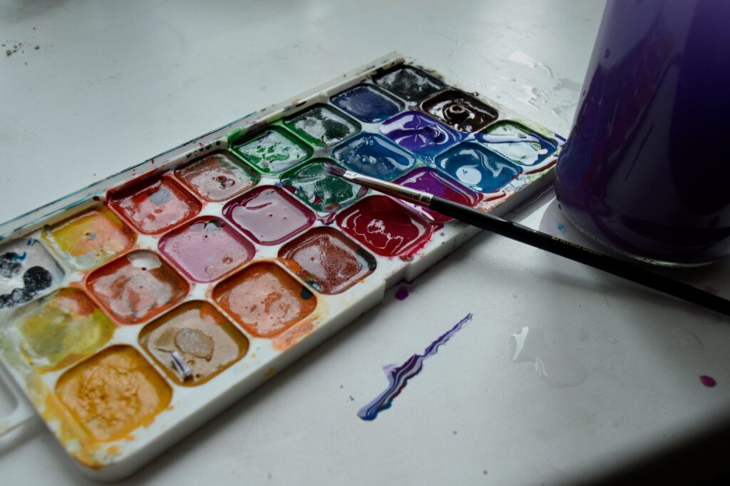
Let’s start with the paint. Whether you’re using acrylic, oil, or watercolor, consistency is key and not just artistically. The actual texture and thickness of your paint will make or break your workflow. Acrylics dry fast, which is great for speed but bad for blending unless you stay ahead of it. Oils give you more breathing room, but come with longer clean up and handling time. Watercolors demand precision and timing. No matter the type, knowing how your paint moves on the surface is half the job.
Now, palettes. Traditional palettes (glass, wood, or plastic) are fine for oils and even acrylics if you move fast. But if you’re working in a warmer climate or take your time layering, stay wet palettes are a game changer. They keep your acrylics workable for hours sometimes days. Keep one on hand if you’re focused on blending or planning a multi day piece.
Tools matter, especially when it comes to palette knives and brushes. For blending, skip the all purpose tools. You’ll want a soft, angled brush for smooth transitions, a stiffer bristle for texture mixing, and at least one metal knife with a decent flex for scratching in and mixing on the fly without wasting paint. The right gear doesn’t have to break the bank it just has to respond well to your motion and mixing style.
Step by Step: Mastering Your First Mix

Before you chase complex palettes or follow influencer presets, master the basics. Start with a solid primary set: one red, one yellow, one blue. Choose honest, unmixed pigments. No shortcuts. This foundation matters more than you think it sets the tone (literally) for everything you’ll blend later.
Once you’ve got your primaries laid out, mix your first pairs in a 1:1 ratio. Start with adjacent colors blue and yellow to get green, red and yellow for orange simple, clean, clear. Watch how your pairs interact, don’t rush it. The key here is even mixing, not eyeballing.
Next, play with temperature. Want your green warmer? Add a touch of yellow. Cooler? Add blue. Subtle changes here will completely shift your palette’s mood. Work slow. Observe. You’ll start seeing the impact of every drop.
Now tune saturation. Grab the complement of your mix (across the color wheel) and add just a touch to dull down a bright hue. Doing a red? A hint of green cuts the pop. This is where control starts kicking in. You’re not chasing boldness anymore you’re shaping tone with intent.
Finally, never scale without testing. Do mini swatches. Watch them dry. See how they feel against white, against other colors. What looks good in the palette won’t always hold up on canvas.
This step isn’t flashy. But it’s the groundwork. Nail this, and everything else clicks into place.
Avoid These Common Mistakes
First, overmixing. It’s easy to keep tweaking a color until you think it’s perfect but that often ends in a pile of dull, grayish mud. The more you stir, the more individual pigments break down and blur into each other. Stop earlier than you think. Let streaks show. Let colors breathe.
Then there’s pigment bias. Not all reds, blues, and yellows behave the same. Some lean warm, some cool. So if you mix a red that leans blue with a yellow leaning toward green, don’t expect a vibrant orange. You’ll get something murky, and probably disappointing. Learn your primaries, understand where they lean. This saves you time and a lot of second guessing.
And finally, clean your tools. Dirty brushes carry leftover colors into every mix turning everything slightly brown, regardless of intent. Rinse often. Wipe thoroughly. Fresh tools mean clean colors. No shortcuts.
Avoiding these three missteps? That’s half the battle won.
Advanced Tips for Next Level Control
When you’re ready to push beyond the basics, finesse becomes the name of the game. Glazing layering thin, transparent paint over dry color is one of the cleanest ways to steer tone without losing detail. It’s not flashy, but it gives you control. Want a cooler shadow? Glaze with a touch of ultramarine. Need warmth? A little burnt sienna goes a long way.
Next, work with a limited palette. That doesn’t mean limiting creativity it means forcing coherence. Fewer tubes = tighter visuals. Pick 4 5 colors that cover the spectrum, and you’ll notice your pieces hold together better. It also trains your eye faster. You’ll start to mix subtleties you didn’t think you could.
Mood matters too. If the atmosphere needs to feel bleak or reflective, neutralize bold tones with their complements toned down reds with green, flashy blues with orange. For punch, intensify instead: go clean, high chroma, and place those spots smartly against muted surroundings. Mixing with purpose moves your painting from color choices to color strategy.
Keep Practicing: Resources for Skill Growth
If you want better color control, start by making your own mix chart. No, seriously grab your set of paints and swatch every combo. It’s not just busywork. Doing this once gives you a visual reference you’ll use for years. You’ll start seeing which colors overpower others, which create surprisingly useful neutrals, and where your pigments lean warm or cool.
Observation matters more than copying. Sure, guides are helpful, but if you’re always relying on them, your eye never improves. Get in the habit of trying to mix paint to match what you see sunlight on a brick wall, a leaf in shadow, the blue of your favorite hoodie. Try, fail, remix.
Want to get deeper into techniques that build on basic color work? Check out A Beginner’s Guide to Acrylic Painting Techniques. It’ll walk you through layering, mediums, and how varied strokes can change how your mixes hit the canvas.
Final Thought: Why Practice Still Beats Presets
Even with smart apps and machine learning spitting out color recommendations in milliseconds, your eye still wins. Algorithms might recognize balance and harmony by the numbers, but they can’t feel tone, tension, or intention not the way a trained human can. In 2026, presets are tools. Your instincts are the difference.
Mixing color isn’t just about science it’s gut, too. You learn what not to mix by messing it up. You feel when a hue is just off, even if it technically matches the palette. That balance of logic and intuition is only built through repetition. Real artists don’t rely on what the software says should work. They rely on what they’ve seen, tested, and corrected themselves.
You want to level up? Tune your eye. Algorithms will keep evolving. But your style, your decisions, your exact blend of color choices that’s what makes it art.


